Setting up an Excel 2016 theme specifically for charting takes a few minutes, but gives you that time back in spades when you're building chart templates and making charts. Setting up themes offers two main time-savers:
- You can choose a font to apply to all of your chart elements. Yes. All of them. Every single one. No more 'I've changed the axes labels, axes titles and the legend out of Calibri already, but I've still got the data labels for all the series to go. . .'
- You can set a colour palette that will meet most of your charting needs and apply it to multiple chart templates.
Before setting up a theme, mock up a rough stacked bar chart (including chart text elements and at least six data series), so that you can see what your charting theme will look like once you apply changes. The chart below uses the default Office theme, with just some minor tweaks in chart templates to increase font size for legibility (hence there's still a chart title and a grey default border).
Figure 1: Office theme

So let's take a look at how to set up a theme.
How to change themes
'Themes' live under the 'Page Layout' tab, on the left of the ribbon.
Figure 2: Where to find 'Themes'

To set up your theme, use the 'colors' and 'fonts' drop-downs next to 'Themes.'
Fonts
Use the 'Fonts' drop-down to pick fonts: if you've made a sample chart like the one above you can preview font changes by hovering on any font within the drop-down.
If you mostly make charts for use in written reports or briefings, pick the same font that you use in your written reports.
Why?
Keeping fonts consistent signals to your readers that 'Hey! This chart belongs with the report text and you should look at it, not skip over it!' Font changes, borders and other stylistic discontinuities between text and charts do the opposite.
Why?
Keeping fonts consistent signals to your readers that 'Hey! This chart belongs with the report text and you should look at it, not skip over it!' Font changes, borders and other stylistic discontinuities between text and charts do the opposite.
In the very unlikely event that you want a chart title in a different font from other chart text elements, you can specify this in the 'Customize fonts' option at the end of the drop down.
Colour palette
The drop-down beside 'Colors' provides pre-set colour palettes, and hovering over these will apply them to your mock-up chart. Doing so can be strangely hypnotic, but eventually you're going to need the 'Customise Colors' option at the end of the menu. This brings up the box below.
Figure 3: Create New Theme Colors box
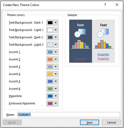
The left box shows the currently selected theme colours; the right box is almost a preview of what you see when the theme is applied. Almost, but not quite.
Text elements
If you're charting against a light background, 'Text/Background - Dark 1' sets the colour of your chart text elements. Well. Kinda sorta. Actually Excel 2016 generates a tint of your selected colour (i.e. adds some white to it) and uses that to display chart text elements.
You can see this below: my 'Text/Background -Dark 1' is set to black: the corresponding chart text elements are a lighter gray (RGB 89,89,89).
Figure 4: 'Text/Background - Dark 1' Selection vs display

This means that the chart text elements above are as dark as they can be set through Themes. To get a darker gray for text elements, you need to use chart templates (if you know another way around this, please let me know!)
Choosing Colours
Use the colour picker with Accents 1 - 6 to pick your chart colours.
When choosing colours, you want a set that works for most of your charts. Don't worry if you can't find something to suit every chart: you can still tweak colours in chart templates (or build another theme).
Here are some recommendations for choosing theme colours for charting:
- One main colour. If you're in an organisation that done the corporate branding thing, this will probably be your main corporate colour.
- Three shades or tints of your primary colour:
- Shades add black to your primary colour, making it darker
- Tints add white to your primary colour, making it lighter
- Use hex.colorrrs.com to convert rgb values to hexadecimal RBGs and enter the hexadecimals into Tinter / Shader to pick tints and shades (read more about Tinter / Shader here). Don't pick adjacent tints and shades, as your choices to be clearly distinguishable within charts.
- One complementary contrasting colour (entering your main colour at Paletton and selecting the 'add complementary' option will give you a contrasting colour, together with some tints and shades).
- One gray(ish) colour - this is useful if you need to display things like 'Don't know' responses to a survey, or other kinds of missing or invalid data.
Figure 5: Chart template example

All done choosing?
Once you've picked your font and colours, go to the drop-down under Themes. You should now have a 'Save Current Theme' option: give your theme a name and save it in the default location. Once you've done this, the theme will be available in the 'Custom' section of your themes, ready to apply to your charts.
No comments:
Post a Comment