Showing posts with label Excel 2016. Show all posts

Monday, 7 March 2016

Life expectancy at 65 in England (Local Authority highs and lows, with some asides about line charts)


Life expectancy at 65 has increased over time in England for both males and females: male life expectancy at 65 increased from 16.2 years for 2000-02 to 18.5 years for 2011-13, whilst female life expectancy over the same period rose from 19.2 years to 21.0 years. Male life expectancy at 65 increased faster than female life expectancy, reducing the gender gap from three years (for 2000-02) to 2.5 years (2011-13).  

Overall, this is an encouraging picture. Nevertheless, beneath the England level figures, substantial variation is found at local local authority (LA) level (and local authority district (LAD) level for two tier authorities).  Figures 1 and 2 show the time series data for female and male life expectancy at 65 for the LAs/LADs with the highest and lowest life expectancy as of 2011-13. 

Figure 1 shows that the highest female life expectancy at 65 were found in Chiltern (a rural LAD in Buckinghamshire) and Camden (in London): the lowest life expectancy of 18.8 years was found in Halton Borough Council (which covers Widnes and Runcorn).  Camden's life expectancy increased rapidly, by 2.9 years, between 2004-06 and 2008-10.  Female life expectancy at 65 for Halton has actually decreased in each of the last two available years: from 19.5 in 2009-11 to 18.8 in 2011-13. I'd expect that there are some public health people in Halton who are pretty unhappy about that.


Figure 1:  Female life expectancy at age 65: highest and lowest local authorities / local authority districts as of 2013

Female life expectancy at 65 for Chiltern, Camden, England and Halton
Notes: Upper and lower 95% confidence limits are shown in faint lines for local authority/local authority district life expectancy. Life expectancy is calculated using a rolling average over a three year period.

Figure 2 shows that for 2011-13, Harrow (in Greater London) had the highest male life expectancy at 65 (21.1 years). Manchester, the LA area covering central Manchester, had the lowest life expectancy (16.0 years).  This male life expectancy gap of 5.1 years is similar to that seen for women (5.2 years).


Figure 2: Male life expectancy at age 65: highest and lowest local authorities as of 2013
Time series chart showing male life expectancy at age 65 for Harrow, England and Manchester


Notes: Upper and lower 95% confidence limits are shown in faint lines for local authority/local authority district life expectancy. Life expectancy is calculated using a rolling average over a three year period.

Whilst these charts show that the life expectancy gap for these particular LAs / LADs has increased over time, it doesn't show anything about what the LA/LAD level life expectancy gap has done in general over this period (Harrow and Manchester are at the extremes of the range in 2011-13, but not necessarily for other years). I'll be pulling together some charts that look at how the life expectancy gap has changed over time for another post.

About the charts

These are fairly simple Excel-based time series charts (primarily made as mock-ups for a data explorer I'm making in SSRS). If you like this design, there are a few things that may be worth noting about how to build these.

Y axis scales

Y-axis scales for time series charts don't have to start at zero. The main purpose of these (and similar) charts is to examine change over time. Starting the y-axis at zero would make the changes too difficult to see clearly - and make the chart unhelpful to users. But - if you are going to ask your readers to compare different charts, make sure the charts use a common format:

  • Apply the same y-axis range to all the charts that will be compared. To do this in Excel 2016, select the y-axis and look under  'Format Axis - Axis options - Axis options.' The option needed is 'Bounds - Minimum and Maximum'  
  • Ensure that the charts to be compared are the same size.  This is straightforward in Excel 2016: under 'Format chart area - Size and properties' check under properties that 'Don't size or move with charts' is selected (this keeps the chart from re-sizing if you expand a column or row) and then  under 'Size', set the chart height and width to the desired dimensions
  • Ensure that colour use is as consistent as possible across charts. In Figures 1 and 2, for example, 'blue' denotes the LA with the lowest life expectancy; teal is used for England-level life expectancy and 'orange' is used for high life expectancy (gray is also used in Figure 1, where two local authorities had the same female life expectancy at 65 for 2011-13).

Replace legends with data labels
Using data labels instead of legends makes it easier for readers to interpret charts quickly.
Ordinarily for charts like these, I'd include both the series name and the final data value as a data label at the right of the chart. This won't work for Figure 1 as Camden and Chiltern share the same final data value. Whilst both series names and final values could still be displayed to the right (just offset up and down), it would be unclear which label related to which data series. I got around this in Figure 1 by adding a blank cell to the start of the x-axis series and to each data series. This provided space to include data series names at the start of the data series, without overlapping the y-axis.

Legends slow readers down, forcing them to look away from the actual chart for extra information. Keep them in reserve for cases where there are no viable alternatives (for example, where data series start and end on the same values).

Line weights combined with tints/shades can be used to emphasise or deemphasise data 

This is a pain in Excel (each series has to be set manually, and chart templates don't seem to consistently solve the problem, unless one is very particular about data set up), but pleasantly straightforward in SSRS.  I've used thin line weights and tints to show the upper and lower 95% confidence limits for the the LA/LAD results. I've also moved the confidence limit series to the top of the data series list (in the 'Select Data' pane), meaning that data series showing life expectancy will always cross in front of confidence limit series.


Thursday, 25 February 2016

Keeping chart text horizontal: Part 3 - Tweaking double-barrelled axis labels

What are double-barrelled axis labels when they're at home?

Individual categories are often grouped into convenient and/or analytically useful over-arching categories:

  • Some U.K. councils group electoral wards into 'area committees' or some synonymous term
  • Within census data, detailed ethnic group categories are aggregated into broader categories

Sometimes analysts chart individual categories - but also  show how they fit within overarching categories. If they use Excel defaults to do so, double-barreled axis labels will result. Here's an example of double-barreled axis labels in a bar chart.

Figure 1: Double-barreled axis labels

Double-barreled axis labels in a bar chart.
This is a reasonably simple, straightforward chart (although there are quite a lot of bars) - but what's that mess at the left side?

The same thing can also happen with bar charts: there it's worse because the x-axis labels for individual categories end up being vertical. Here's an example with vertical x-axis text and a bonus vertical y-axis title.

Figure 2: Double-barreled x-axis labels

Double-barreled column chart with vertical x-axis labels


The basic idea of chunking individual categories into overarching groups is great. People find it easier to make sense of and remember lots of bits of individual information if they are grouped together in meaningful ways.  So how can we keep the 'chunking' but lose the vertical text that is making these charts harder to read?


Turn column charts into bar charts

Transforming column charts into bar charts will immediately reduce the amount of vertical text that has to be removed. Right-click on chart area, select 'Change Chart Type' and swap the column chart out to a bar chart.

Add blank data series

Once you've got a bar chart, take a look at the data used in the chart. First off, if you have any merged cells in your 'overarching categories' series, unmerge these. Then insert a couple of empty rows between each category.  Finally, reselect your data so that you have an empty row at the top of the chart. You should now have a data selection that looks a bit like this...

Figure 3: Sample data with empty data series added
Chart data with blank data series added.


and a chart that looks something like this:

Figure 4: Adding blank data series

Getting rid of vertical text - adding extra blank data series at end of category groups

Reorganise axis labels
Next, copy the overarching category labels into the same column as your individual data series, and delete the column they were previously in (or reselect the chart data without that column). Your data should look something like the sample data below.

Figure 5:  Data for chart without vertical axis text. 

Example of how to structure data to avoid vertical text in two-level axis labels

At this point, there is no more vertical text in the chart - but the overarching category headings look like any other category label on the axis. They need to be distinguished in some way. The simplest way to do this (there are others) is to add spaces after the category heading, such that all the headings appear left justified. If category header names are long, it may also be necessary to use Alt-Enter to split text over two lines.

The final chart should look something like this.

Figure 6: No more vertical text

Chart with two-level axis categories and no vertical text

This chart takes up a little more space than the original, but getting rid of the vertical text has the nice side effect of visually grouping related bars together. This makes it easier to compare values within categories.

Summing up

In this 'Keeping chart text horizontal' series, I've looked at how to get rid of three varieties of vertical text in charts:

Y-axis title
This is both the most common and (fortunately) the most innocuous type of vertical text. It's the sandfly of vertical chart text: mostly harmless and irritating, but enough of them will ruin a day at the beach.

But, like sandflies, they're easily swatted. If the y-axis title is painfully obvious, just remove it. If it's only very obvious (or not particularly obvious at all or actually quite obscure), then resize the chart and plot areas, so there's a little space at the top and change the text orientation to horizontal. Save the chart as a template - next time the y-axis will be in the right place.  Here's our video showing how to do it: https://youtu.be/zL6l3Rv2vqs and here's a link to 'Keeping chart text horizontal: Part 1, Reformatting y-axis titles'

Vertical x-axis text
These usually happen in crammed column charts. The solution is to make a bar chart instead, so that the category labels are set out vertically. There's a walk-through of how to do this in 'Keeping chart text horizontal: Part 2, Getting rid of vertical x-axis text in charts'.

Double-barrelled axis labels
These happen in column and bar charts with sub-categories grouped into larger categories. See above.

Monday, 22 February 2016

Keeping chart text horizontal: Part 2, Getting rid of vertical x-axis text in charts


Vertical text in charts is a pet peeve of mine. Actually, no. It's not. Vertical text is a substantial and entirely unnecessary barrier to the effective communication of key messages and data findings to readers, some of whom are supposed to use these messages to plan services and make policies that potentially affect all of our lives.    

Around half (52.0%) of adults surveyed in the OECD Skills Outlook 2013: First Results from the Survey of Adult Skills had numeracy skills assessed at Level 2 or below (a proportion which rises to 57.5% in England and to a whopping 61.3% in the U.S.). Around 28.0% of those with an undergraduate degree (OECD-wide) had numeracy skills assessed at Level 2 or below. 

This means that if you are displaying data to a general audience within OECD, you need to assume (bearing in mind country-level variations) that around half of them find it difficult to interpret complex charts and graphs. If you're sharing charts and graphs with policy makers and service planners, you need to assume that a fair chunk of them are in the same position. Within this context, it's flat-out foolish to make reading the chart text difficult by putting it on its side. 

Here's the thing: policy makers and service planners who look at an unnecessarily complex chart and get that panicky feeling of 'OMG I'm such an imposter! Why can't I understand this?' aren't thinking about the messages in the data. Depending on how much time they have available and how persistent they are, some of those policy makers and planners will get past their initial reaction and reason their way through: others will put it in the 'too hard' basket. They'll still be planning policies and making services - but now they'll be doing so without the evidence. And that's bad for everybody.    

So - now that I've got that rant out of the way - let's take a look at how to get rid of vertical x-axis text. 

Vertical x-axis text usually happens when a data analyst tries to cram a whole load of categories into a column chart. The (modified) stack column charts below are good examples of this.  They are taken from the OECD (2013) OECD Skills Outlook 2013: First Results from the Survey of Adult Skills. In general, this is a very useful and informative report, but some of the charts could be clearer.  

Example 1: Stack column charts with vertical x-axis labels


Example chart with vertical x axis labels


These charts show the percentages of respondents reporting changes in their workplace, broken down by country (on the x-axis) and work type/skill level (within each stack). Overall breakdowns by clerical and manual work are distinguished through their respective positioning above and below the '0' point on the y-axis. The 'total' line (which shouldn't be a line at all, as the x-axis displays categorical data) shows the overall percentage of respondents reporting changes in their workplace. There's a lot of information packed into this chart - which is great, but makes it important that the text elements are easy to read. 

The easiest way to get rid of vertical text from a stacked column chart is to turn it into a stack bar chart instead. This can be done very simply by changing the chart type from 'stack column' to 'stack bar' (or applying a custom stack bar template if you have already designed one).  If you want to use a mirrored axis in your chart (as used to chart manual workers in this example), ensure that the data series' to appear 'below' zero on the x-axis are assigned negative values.

If you're planning to use a mirrored x-axis, don't panic if you see a horror like this when you first create the chart.

Figure 1: Stack bar chart before formatting

Example of part-completed stack chart with axis text sitting on top of bars

This can quickly be turned into something more useful by taking the following steps:
  1. Reduce the white space between data series by using 'Format data series - Series options - Reduce gap width.'  I find a gap width of 50% to be about right for a bar chart (not the 150% that comes as an Excel default)
  2. Reverse the order of countries on the y-axis (so that the average appears at the top of the chart) by selecting the y-axis and, under 'Format axis - axis options - axis options,' checking the 'categories in reverse order' and selecting the 'horizontal axis crosses at maximum value' option.
  3. Whilst still in the same 'Format axis - axis options' menu, move the axis text clear of the data series by selecting the 'label' drop down and selecting label position: 'low' (not 'next to axis').
  4.  Finally, to display only positive values on the x-axis (and show that these are percentages), select the x-axis and under 'axis options - number' drop down, enter the following 'custom' format:  #,##0"%";#,##0"%"

Once those steps are taken you'll have something more like this: 

Figure 2: Stack bar chart after main formatting changes made

Depending on your Excel themes, you might still need to tweak some colours and reposition the legend - but at this point, the chart is pretty much ready to go. 

My final version looks like this: 

Figure 3: Organisational change and new technologies: Percentage of workers who reported change in their current workplace in the last three years that affected their immediate working environment

Note: Total percentages reporting change are reported in brackets by each country name. In both charts, countries are ranked in descending order of the percentage of workers with low and high clerical related skills who reported changes. This means that the order of countries varies between the two charts.

I've made a couple of other smaller tweaks along the way:
  • overall percentages of workers reporting change are given in brackets beside the country name (instead of as a separate line series on the chart). This uses a simple concatenation formula using '&', that combines the country name, a couple of little text strings for spaces and brackets, and the percentage of workers reporting change  (Here's an example:  =A8&" ("&G8&"%)"    )
  • The order of categories in the legend corresponds to the order in which data series appear on the chart (I did this as a simple cut and paste in MS Paint).
  • The OECD average is pulled out and displayed at the top of the chart, rather than within the sorted countries.
  • I've shared one legend between the two charts - again using MS Paint to stitch the different charts and the legend together. 
The rest of the chart is left largely unchanged: colours are used to distinguish manual and clerical workers, with manual workers charted to the left of the x-axis and clerical workers charted to the right.


This chart has its flaws, some of which are also found in the original. There's a risk that cursory readers will assume that the list of countries in the second chart duplicates the first, resulting in their attributing data in the second chart to the wrong country. I've reduced that risk by noting explicitly that the country labels are not duplicates - but it would be better to find a visual solution. Both bar and stack column graphs have the general disadvantage that it is hard to compare the relative size of individual data series that are not located next to the '0' on the x-axis (in this chart, for example, it is hard to see small country level differences between high skilled workers). 

Nevertheless, I think this chart is easier to read than the original. It's easier to see at a glance which countries have high proportions of clerical workers reporting change (and which countries have high overall proportions of workers reporting change).  


A caveat about the data
On looking more closely at the data table underlying these charts, I found that the data for the components within the stacks did not add precisely to the reported total (this isn't apparent in the chart itself). There were no huge differences, but it didn't look like a simple rounding issue. A bit of digging in the European Working Conditions Survey 2010 (EWCS 2010) which the data source (tables available here) suggests that PIAAC derived its breakdowns from respondent counts and 'yes'/'no' row percentages rounded to one decimal place for each occupation/skill category. They did so without taking their derived respondent counts back to the nearest whole person, meaning that the components don't quite agree with the total reported (which is taken directly from the EWCS 2010 data). Basically, they have accumulated some rounding error in recalculating the data. Among other things, that makes the second decimal place in the data tables a nice example of over-precision. 

If I were going to use this data for analysis, I'd recalculate the lot. For most countries the impact is fairly trivial, but for a few with smaller respondent counts (such as Turkey, which has a correctly reported total of 20.8%, but derived components totaling 23.12% for the proportion of workers reporting changes in processes or technology) it is more pronounced.  As my purpose here is just to demonstrate redesign options that are easier to interpret, I've just noted the discrepancy here.


Wednesday, 17 February 2016

Keeping chart text horizontal: Part 1, Reformatting y-axis titles


We've all been there. Scanning through a report trying to figure out its main findings and suddenly . . .

PIAAC chart with vertically aligned text


it's off to the physiotherapist with a stiff neck . . .

Vertical text is often used in charts - but it doesn't make for easy reading. A paper copy can be flipped around, but people mostly read reports on screen. The reader might be able to rotate the screen image, but does the writer really want readers to stop thinking about the statistics and start thinking about how to fiddle about with their displays?

The chart above is taken from the OECD Skills Outlook 2013 'First Results from the Survey of Adult Skills.' It's actually a very useful, comprehensive report for people with an interest in numeracy levels within OECD countries. To my mind, that's pretty much everybody involved in displaying charts and statistics to the general public and non-expert readers in OECD countries.

A big 'take away' message from the report is that across the OECD, around 52% of adults had numeracy skills at Level 2 or below.  Those at Level 2 (around 33%) will be able to manage "basic analysis of data and statistics in texts, tables, and graphs" (p.76), but are likely to struggle with charts and tables that are more complex. This doesn't mean charts should be 'dumbed down': it does mean avoiding chart design choices that make data interpretation harder than it needs to be.

One of the best and kindest things you can do for all of your readers (surprisingly large proportions of whom may get antsy when confronted with charts and data tables) is to make sure that all the chart text goes in the same direction. Vertical chart text makes data interpretation feel like hard work, even if the actual messages in the chart are straightforward. It disrupts readers' flow and makes them more likely to skip over charts, or just get frustrated and stop reading altogether.

Euuwwgh!  . . . How did that vertical text get into my chart? How do I get rid? 


Excel defaults are a frequent culprit. There are three main types of vertical text I've come across that are encouraged by Excel defaults. Each needs to be dealt with differently.


Type 1: Vertical y-axis text

Example chart showing vertical axes chart elements
Default y-axis titles are the type of vertical text I see most often in charts. Whilst they're relatively harmless, I find them irritating precisely because they are so easy to remove. Here's how: 
  1. Decide whether or not any axis text is needed at all. Despite what's sometimes taught in school, axis titles are often redundant. A good rule of thumb is that you don't need an axis title if it makes you think 'Well duh!' and roll your eyes. 
  2. If the axis title adds information, then make it easy to read. Align it horizontally and place it at the top of the axis. In Excel 2016, this can be done by selecting 'Text direction: Horizontal' under  'Format Axis Title - Text Options - Textbox'. Then drag it where you want it to display, resize the chart and you're done. Save your chart as a template (Right-click on chart and save as template), and the next time you want to make a similar chart, the box for the axis title will already be correctly positioned.
Type 1: No more vertical text
Example chart with vertical text replaced by horizontal text


The other two types of vertical text that pop up in charts are vertical column labels (as in the example from the OECD Skills Outlook above), and vertical axis category labels (as in the bar chart below).

Type 3: Two-level axis labels in stack charts


I'll look at how to get rid of these types of vertical text in a future post. 


Update:  I've added a YouTube video demoing how to replace vertical y-axis text with horizontally aligned text here


Monday, 15 February 2016

Building bubble grid charts in Excel 2016


This post looks at how to use Excel 2016 to build a bubble grid chart like the example below.  Bubble grid charts of this type are basically decorated data tables - but the decoration should help non-expert readers to grasp the key messages more quickly than would a data table alone. 


Figure 1: Outcomes for offences recorded in 2014/15 by offence type 


Bubble grid chart showing break down of crime outcome by offence type.

Note: Offence outcomes are broken down by percentage within each offence type. For example, just over half (50.8%) of recorded robberies had an outcome of ‘Investigation complete – no suspect identified.’ Data labels are shown for values greater than 4 per cent.
Data source: Crime Outcomes in England and Wales 2014/15: Data tables, Table 2.3; https://www.gov.uk/government/statistics/crime-outcomes-in-england-and-wales-2014-to-2015

Use bubble grid charts when:
  • it's more important for readers to notice the big messages quickly than to make detailed comparisons between similar results   
  • many categories are broken down by many result options 
  • there are substantial differences between categories and in the distribution of outcomes/results (bubble grid charts do not show subtle differences well).
Here's how to build them.

Setting up tables for a bubble grid chart

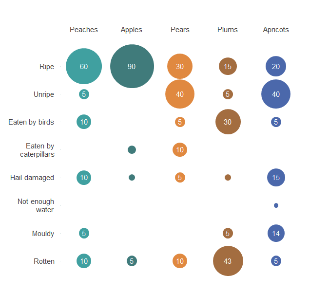
First of all, have a look at the data table that you want to chart. I've made a simple table 'Fruit types by condition' as an example. 

Figure 2: Fruit types by condition
Sample data for bubble grid chart


Each of the numeric values in this table is going to end up corresponding with x-y coordinates on a grid. In this table I have five fruit types and eight different fruit conditions. I've also added a blank row, which will provide a placeholder for axis labels. 

In addition, the fruit types and their possible conditions are also going to be assigned points within the grid, with their data labels replacing axis labels. This workaround is needed because Excel does not allow user-selected axis labels. 
I'm going to set up another table to hold the x-y coordinates for all of the numeric data points within the chart, and some of the information that will be use for data labels. 

Figure 3: Example of a grid table holding x-y coordinates for a bubble grid chart

Example grid for bubble grid chart


The first column 'y-axis' includes a y-value for the x-axis labels ('0') and a y-value for each of the available conditions ('1' to '8'). I want the data for 'Peaches' to appear first in the chart, so have assigned it an x-value of '1'; 'Apples' will come next with an x-value of '2' and so on until all the types of fruit have an x-value. 

Finally, I need to create x-values for the x-axis labels, and y-values for the y-axis labels. I've also created some columns with arbitrary bubble sizes, to make it easier to work with the chart. 

Figure 4: Coordinates for axis labels and arbitrary bubble sizes for data labels


Remember - these are just arbitrary positions in a grid. They do not hold any information themselves: they just create a place for the data and axis labels to be.

Setting up the chart


Adding Bubbles

Select any points within the grid table and insert a flat bubble chart (not 3D!). Don't worry about selecting the full grid: you'll be removing the data series before adding new ones. I've already got my chart theme set up (find out how to set up chart themes in this tutorial), so I get something that looks like this.  

Figure 5: Bubble grid chart Step 1. 

Circles on bubble grid chart.


First, format the chart area so that it does not move or resize with cells (under Format Chart Area -- Size and Properties -- Properties -- "Don't move or size with cells"). Then delete the chart title and remove all existing data series (Select Data Source - Remove)

Figure 6: Select Data screen: clear out those data series

Select data screen


That leaves a blank chart - so it's time to add in a first data series

Figure 7: Adding data series to bubble charts

Edit series screen


"Peaches" is the series name (select the cell)

The x coordinates for 'Peaches' series are all '1' (see Figure 3)

The y coordinates are '0' - '8' (see Figure 3)

The bubble sizes for 'Peaches' are taken from Figure 2 (including the blank cell immediately below 'Peaches').

Once you've added in all of the data series, you should see something like this:

Figure 8: Bubble grid chart, Adding data series

Bubble grid chart with bubbles, but no scaling, axis labels etc.

This still needs work -- but it is starting to resemble the finished product.  The next step is to reverse the order in which the 'fruit conditions' are presented, so that these mirror the data table. To do this, right click the y-axis and select 'Format Axis'. Under 'Axis Options', check the 'Values in reverse order' box: this flips the order in which the different conditions appear. 

The size of the circles can be scaled under 'Format data series - Series options': I'm going to use 65% for this chart.  
NB: Make sure that you have selected 'Size represents Area of bubbles' not 'Size represents Width of bubbles'

Adding axis category labels

Excel 2016 won't allow you to specify a range of cells as axis values - so I'm going to set up some data labels that look like axis values.  To do this, I need to add two more data series: one for the x-axis labels (fruit names) and one for the various conditions of the fruit (e.g. ripe, mouldy and so on). 

To add a data series for the x-axis labels, select data, then add and name a new data series. For the x-coordinates, select all of the x-values that have an associated data series (for my example, the x-coordinates are {'1', '2', '3', '4', '5'}), as can be seen in Figure 3.  All of my y-coordinates are '0' (see Figure 4: y-values for x-axis labels). I've set the bubble sizes to an arbitrary '2'. Once the axis labels are added, these will be resized to become invisible. 

To add a data series for the y-axis labels, select data, then add and name a new data series. For the x-coordinates select a low y value (often '0', sometimes 0.5); for the y co-ordinates select all y-values that have an associated breakdown (for my example, the y-coordinates are {'1','2','3','4','5','6','7','8'}) as can be seen in Figure 3.  Again, I've set the bubble sizes to an arbitrary '2'. 

After following these steps, you should see like this, with a row of dots at the top of the chart, and a column at the left side: axes labels will be added to these.  

Figure 9: Bubble grid chart: adding data series for axis labels

'Dummy' bubbles for axis labels added to bubble grid chart.


To add the x-axis labels, select the top-most data-series and add labels. Then click on the labels and select 'Format data labels.' Select 'values from cells' and select the cell range containing names of the data series charted (all the fruit names in my example). Position the data labels above the data points, and resize fonts if needed. 

Follow the same process to apply y-axis labels, but select the cell range containing names of the outcomes / results (all the conditions of fruit in my example). Position the data labels to the left of the data points and again, resize the fonts if necessary.

Once you are satisfied, change the bubble sizes for the associated data series to a very small value (0.001 for example) and turn their colour fill to white: this effectively renders them invisible.

You should now have something that looks like this: 


 Figure 10: Bubble Grid Chart: ready for final formatting

Bubble grid chart: axes labels added, only cosmetic changes left to go


This still looks a bit rough, but the last few formatting changes are straightforward:
  • Add data labels (showing bubble size) to each of the data series. Centre the data labels, and adjust font size and colour to ensure legibility. Individually delete data labels where values are small - but use a consistent criteria. 
  • After making any adjustments needed to minimum and maximum axis values, remove the axes labels (the actual axes labels - not the data series labels that are pretending to be axes labels) and all grid lines. 
  • Check that you are happy with the scaling and the layout of chart text elements
  • Remove the gray border around the chart area 
  • Check that the data are correctly charted.

 Figure 11: Bubble Grid Chart: the final versionFinished bubble grid chart
Note: Values of less than 5 are not labelled. 

Bubble grid charts are a bit more complex than some chart types in Excel, but once you know how to set up the data for the chart, these are surprisingly quick to build. 


Thursday, 11 February 2016

Bubble grid charts: an alternative to stacked bar/column charts with lots of data series?


Stacked column charts with a large number of categories and data series can quickly become unclear. Deciphering this stacked column chart from the Home Office "Crime Outcomes in England andWales 2014/15 " for example, takes some work - in part because of some unfortunate design choices. 
(Click on the charts for a closer view) 

Stack bar chart with lots of data series.

But even if the design was improved, by flipping the chart through 90° and applying some other formatting tricks, it would still be difficult for readers to see the main points at a glance.

So what to do ?


Monday, 8 February 2016

Small multiples - when stack bars just won't cut it . . .


Stacked bar charts can help readers make quick comparisons across categories. They can be particularly useful for breaking down responses to straightforward survey data - such as perceptions of services running on a scale from satisfied to dissatisfied - by demographic factors such as sex and age bands.

Formatting techniques, such as using white space to chunk related categories together, using axis labels to report category names and base sizes together, and thoughtful colour choices reflecting the logic of what's being charted, can all help make interpretation of stack bar charts fairly straightforward.  I've demo'd one approach to stacked bar chart design, showing how to use these and other formatting techniques in Excel 2016 to make charts to help non-technical readers out - not freak them out.

But sometimes, a stacked bar chart just won't cut it . . .

Wednesday, 3 February 2016

How (and why) to set up an Excel 2016 theme for chart design


Setting up an Excel 2016 theme specifically for charting takes a few minutes, but gives you that time back in spades when you're building chart templates and making charts. Setting up themes offers two main time-savers:
  • You can choose a font to apply to all of your chart elements. Yes. All of them. Every single one. No more 'I've changed the axes labels, axes titles and the legend out of Calibri already, but I've still got the data labels for all the series to go. . .'     
  • You can set a colour palette that will meet most of your charting needs and apply it to multiple chart templates.

Friday, 29 January 2016

Tinter-Shader and Excel Themes for charts

I've been doing some work on designing Excel themes geared towards chart design (which can save a chunk of time later on when designing charts and chart templates), so wanted to give a shout out to Color Tinter-Shader, a free online tool that I've found really useful this week.


Tuesday, 26 January 2016

What do low adult numeracy levels mean for chart design?


If you're reading this, youre probably in the business of turning data into information. You're confident with statistics and you spend a fair amount of your day working with numbers. So when you're reading a report and you come to a chart or a data table, it's not a big deal. You'll look at it to see what it shows – and even if it's not a great chart or table, it's not going to make you feel like this:

Edvard Munch - The Scream