If you're reading this, you’re probably in the business of turning data into information. You're confident with statistics and you spend a fair amount of your day working with numbers. So when you're reading a report and you come to a chart or a data table, it's not a big deal. You'll look at it to see what it shows – and even if it's not a great chart or table, it's not going to make you feel like this:
 |
| Edvard Munch - The Scream |
But that is how some people feel as they wade through statistical reports. A substantial proportion of adults lack numeracy skills, and consequently feel intimidated and even frightened when interpreting charts and tables. The OECD Skills Outlook 2013: First results from the survey of Adult Skills found that in OECD countries, around one in five adults aged between 16-65 (19.0%) were assessed at Level 1 or below (on a scale where 'below Level 1' is the lowest numeracy level, and Level 5 is the highest). A further one in three surveyed (33.0%) had only Level 2 numeracy skills.
Among OECD respondents with an undergraduate degree, around 28% had numeracy skills at Level 2 or below.
It is likely that some of the people who are (or should be) using your reports and analyses to make decisions about business, service delivery – and all the other things that organisations make decisions about – have numeracy levels in this range.
What does this mean for chart design?
The mathematical tasks and processes that a person with Level 1 numeracy skills can carry out are limited, but include "identifying elements of simple or common graphical or spatial representations." At Level 2, a person would usually be able to engage in "interpretation of relatively simple data and statistics in texts, tables and graphs" (see OECD Skills Outlook 2013: First results from the survey of Adult Skills, p.76 for full descriptions of proficiency levels in numeracy).So how can you structure your reports, charts and tables to help people who are not confident with numbers use your findings to make informed decisions that may affect people’s lives and livelihoods?
Here a couple of quick tips that are easy to implement. We'll look at more in future posts.
Tell the story of your data and use charts to illustrate that story
Describe the takeaway points from your chart or table in a couple of sentences before presenting it. Doing this gives readers clues about what to look for, and means that they should have enough information to keep on reading, even if they find the chart difficult to understand.If you can't explain the main features in a couple of sentences or a short paragraph, the design may need more work, or you may have more data exploration to do, In any case, it's unfair to expect readers to understand a chart that its designer can't explain.
Take the charts out of the box!
Readers should move seamlessly between text and charts. Visual cues in reports should support this flow, not undermine it. Struggling readers should not receive subtle visual cues that say ‘This thing is separate from the text – look! It's in a box all by itself’ or, even worse, ‘Here's a natural place to stop reading.’Here's an example of what not to do:
Instead, try something more like the simple example below: start with some explanatory text and integrate the chart within your main reporting.
An example:
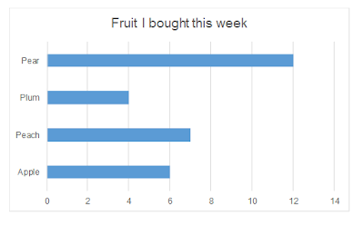
This week, I bought twenty-nine pieces of fruit, of which twelve were pears (as they were on sale). As can be seen in Figure 1 below, I also bought smaller numbers of peaches (7), apples (6) and plums (4).
Figure 1: Fruit I bought this week
Haven't done much with Excel charts in 2016 yet and not sure how to get rid of borders in your chart templates? Check out our video tutorial on YouTube.


No comments:
Post a Comment